Find out what it takes to ensure customers stay in the loop and remain top of mind.
We’ll explore transactional email best practices, look at examples with visuals and compare marketing vs. transactional emails.
Here’s what you need to know to keep active users informed and engaged throughout the customer journey.
What Is Transactional Email?
A transactional email is just what it sounds like: an email a person receives after a transaction.
If you’ve ever made a purchase online, you’ve likely received one or more ecommerce transactional emails. You don’t have to buy a product online to get one though. Companies also send them out after a user creates an account or completes a sign-up process.
Think about it: How many times have you opened your inbox and seen “We’re confirming your order” or “Here’s your tracking update” or “Congratulations, you’re now registered”?
This form of communication keeps users updated on the status of their specific interaction with your brand. It’s also a way to maintain positive customer relations. Above all, customers expect and anticipate them.
Use These 11 Transactional Email Best Practices
Now that you understand the meaning of transactional emails, let’s look at some best practices to make sure you get the most out of your messaging.
1. Avoid Using No-Reply Addresses
As a customer, there’s nothing worse than having a question and not having the option to easily get the answer you need. When you send a transactional email from a no-reply email address, you’re putting up a roadblock at a time when you want to be building a bridge.
Make it easy for someone to hit reply with any question they might have and be sure the reply goes to a monitored email account. Not only does a reply-to email address show users you actually welcome any communication, but if a user does reply, that email address automatically is added as a contact in your address book.
This one best practice has been shown to increase engagement and deliverability.
2. Be Clear and Provide Relevant Details
First, include a clear “from” address. This provides recipients with a frame of reference and helps them with inbox organization.
Examples include:
- [email protected]
- [email protected]
- [email protected]
- [email protected]
- [email protected]
- [email protected]
- [email protected]
Be succinct and specific in the subject line of your email. Use preheader text, which is the brief text that appears in the inbox below the email subject, to further clue readers in on what the email’s about. Concisely cover the who, why and what of your message.
3. Make Your Brand Known
Include your company name in the email so you’re instantly recognizable. Also consider including your logo within the body to maintain visual branding consistency and create that extra pop that’ll set you apart from the crowd.
Consider this: Would you have an instant frame of reference and be more likely to remember a plain text, unbranded reply email or one with a logo and company name prominent?
Another reason to go the extra mile? Email subscribers could view unbranded, text-only messages as spam, and you certainly don’t want that.
4. Include Valuable, Relevant Content
Think about informational content your recipient might find valuable based on their transaction and consider including that at the close of your email. For example, if a customer purchased a subscription to your online platform, in your welcome email you might include links to how-to videos or helpful articles to navigate the platform and make the most out of the purchase.
5. Secure Your Messages
Avoid potential email breaching and loss of customer trust by securing your emails. Learn how 3 security protocols can help.
- Sender Policy Framework (SPF): an email-authentication standard that helps guard against phishing, spoofing and spam
- DomainKeys Identified Mail Signature (DKIM): a protocol able to verify that an authorized mail server is sending an email
- Domain-Based Message Authentication, Reporting and Conformance (DMARC): a protocol that builds on SPF and DKIM to improve and oversee protection of the domain from deceptive emails
6. Keep Mobile in Mind
With nearly half of users accessing their inboxes from a mobile device, ensure your email is mobile responsive. You don’t want users to have to struggle to read your email if they’re not on a laptop or desktop. By having the email automatically adjust to any screen size, you’ll make the post-transaction experience all the more pleasant.
7. Include a Clear Call to Action
Whether you want recipients to check their order status or leave a review, make sure your call to action (CTA) is clear and enticing. Use A/B testing to see how different styles of CTAs and positioning impact users taking the desired action.
8. Personalize Your Message
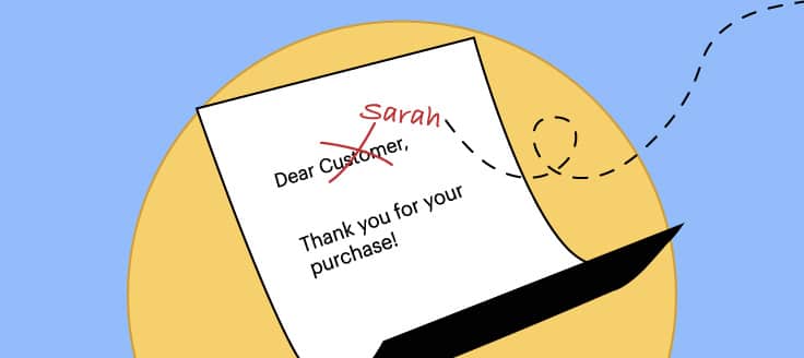
When you think of personalization, you might think of including a merge field with the user’s name, but there’s more to it than that. Address recipients in second person, using words like “your” or “you.”
For example, you’ve probably seen an email with a similar subject line: “Your refund for order XXX is processing.”
9. Preview Emails Before Sending
Use an inbox preview to see how your email will display on Outlook, Gmail, Android, iPhone and iPad. Make sure that all the components you wanted are displaying correctly. Also, double-check for typos and any errors in design or HTML. Test links and CTAs, too.
As a triple-check, send a test version of the email to yourself before you set it in motion.
10. Use a Separate IP Address and Domain
Your transactional emails should be sent from a separate domain space and internet protocol (IP) address than your mass marketing email. Why? Marketing emails can be prone to complaints and more frequently marked as spam. If your transactional emails are coming from the same IP and domain, there’s a chance they’ll be treated the same way.
That said, it’s important to note that mailbox providers take domain-sending and IP address reputation into account when filtering messages, whether marketing or transactional. A poor one may lead to your emails being blocked or filtered.
11. Monitor Engagement and Complaints
Leverage your email platform analytics to monitor key performance indicators that could provide insight into what’s working and what’s not. Because your transactional emails could be sent to spam, you’ll want to keep track of your opens, clicks, complaints and bounces.
Send transactional emails the same time as marketing emails as well as at different times of the day to help identify which variables might be stymieing delivery. Also, register with your email service provider’s feedback loop to monitor complaint rates. This could also help you identify why your messages might be getting blocked. Keep in mind, the lower your spam complaint rate, the better.
And while we’re on the topic of avoiding the spam filter, here are a few more tips to avoid getting flagged. Don’t:
- Use all caps
- Employ image-only emails
- Attach files to your emailed text
- Use multiple exclamation marks
Transactional Email Vs. Marketing Email
When you think of marketing vs. transactional email, consider that marketing emails are sent strategically to promote a product or service with the primary purpose being to drive conversions and sales. They’re typically sent in mass.
Marketing emails include:
- Coupon and discount emails
- Event invites
- New product releases
- Newsletters
- Product updates
- Sale emails
- Special offers
Example of a Marketing Email
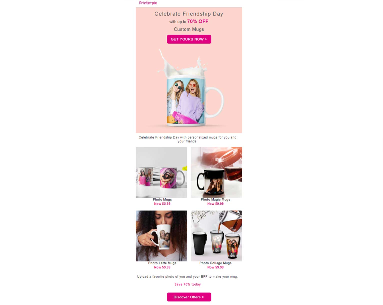
This Friendship Day marketing email from Printerpix is clearly a promotional effort. The company’s casting a line in hopes of a bite. The sole purpose of the ad is to make recipients aware of the sales they’re running.
A clear call-to-action button at the top of the email allows readers to easily click through to the company website and see more options. And in case that doesn’t draw you in right away and you make it to the bottom of the email, there’s another call to action to help seal the deal.
As you’ve noticed, transactional emails are automated, personalized responses set into motion by certain actions a user completes. What’s more, users are often looking forward to this type of follow-up communication. As a result, transactional emails have higher open and engagement rates than marketing emails.
According to the credit-reporting firm Experian, purchase and shipping confirmations with an order tracking link have twice the number of click rates and 23% increased transaction rates than confirmations without status links.
While transactional emails can include a brief amount of promotional or cross-selling content and can function to build brand awareness, that isn’t the focus. In fact, transactional emails for U.S. subscribers need to align with the CAN-SPAM Act and headers and subject lines must accurately reflect the main purpose of the email. In addition to other meeting other stipulations, they can’t deceive recipients with misleading subject lines or headers that don’t align with the email content within.
The U.S. Federal Trade Commission notes:
“The primary purpose of an email is transactional or relationship if it consists only of content that:
- facilitates or confirms a commercial transaction that the recipient already has agreed to;
- gives warranty, recall, safety or security information about a product or service;
- gives information about a change in terms or features or account balance information regarding a membership, subscription, account, loan or other ongoing commercial relationship;
- provides information about an employment relationship or employee benefits; or
- delivers goods or services as part of a transaction that the recipient already has agreed to.”
Experian also noted transactional emails with cross-sell items have higher transaction rates than those without, 20% specifically.
Examples of Transactional Email Designs
Here are examples of transactional emails that could be floating around in your inbox:
- Welcome email
- Abandoned shopping cart reminders
- Double opt-ins
- Incomplete setup reminders
- Legal notifications
- Order out for delivery notices
- Order receipts
- Order refund notices
- Package delivery notifications
- Password resets
- Policy updates
- Registration confirmations
- Re-engagement emails
- Shipping confirmations
- Subscription renewal reminders
Let’s look at a few visuals to bring some of these types of transactional emails to life.
Password Reset Email
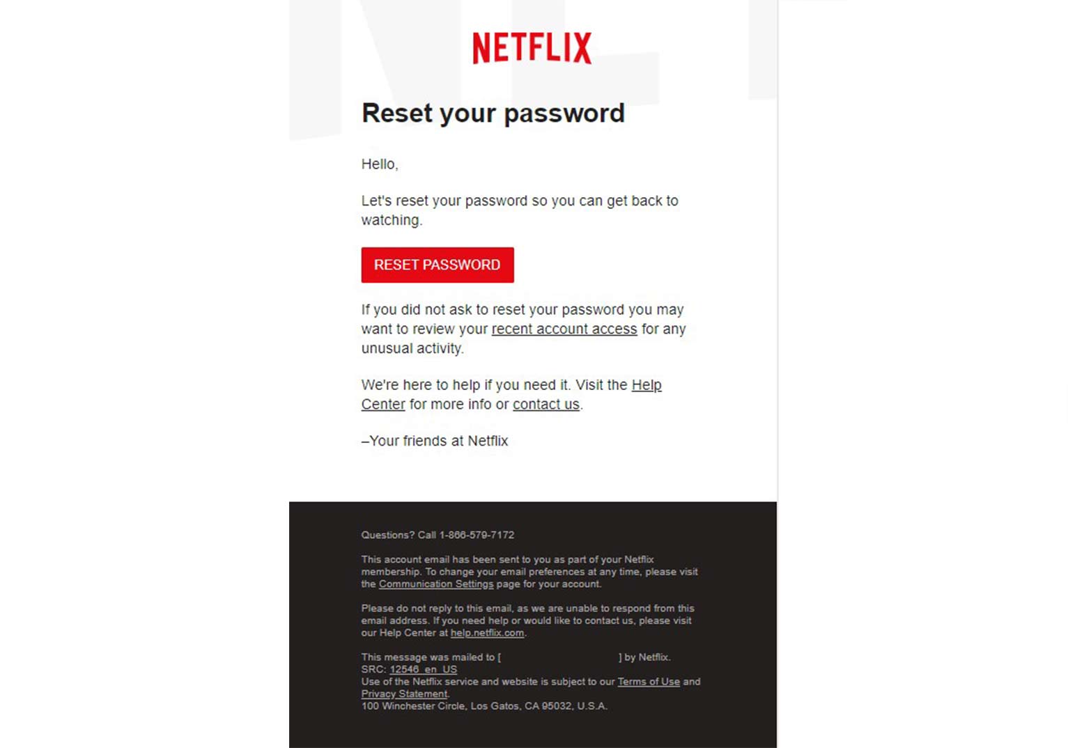
Here’s an example of Netflix password reset email. The subject of the email is “Complete your password reset request” and the sender line reads “From: Netflix <[email protected]>.”</[email protected]>
Additionally, the body of the image is clearly branded and the “Reset Password” button can’t be missed. In addition, there are links if you need help or want to reach out to Netflix with questions.
Subscription Renewal Email
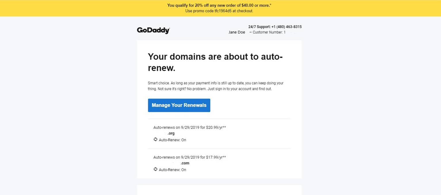
Here’s a snapshot of a subscription renewal GoDaddy sent out. The email includes the user’s first and last name and customer number (changed for privacy) are at the top, along with a customer support number. There’s a clear CTA and specific domains expiring are listed (specific domain name removed) and the cost and date for renewal are included.
What you don’t see is that the subject line includes the recipient’s name followed by the words “Your GoDaddy Renewal Notice.”
The “from” field? GoDaddy Renewals <[email protected]>. </[email protected]>
From the subject line and the content of the email, you know who, what and why you’ve received this message.
Review Order Email
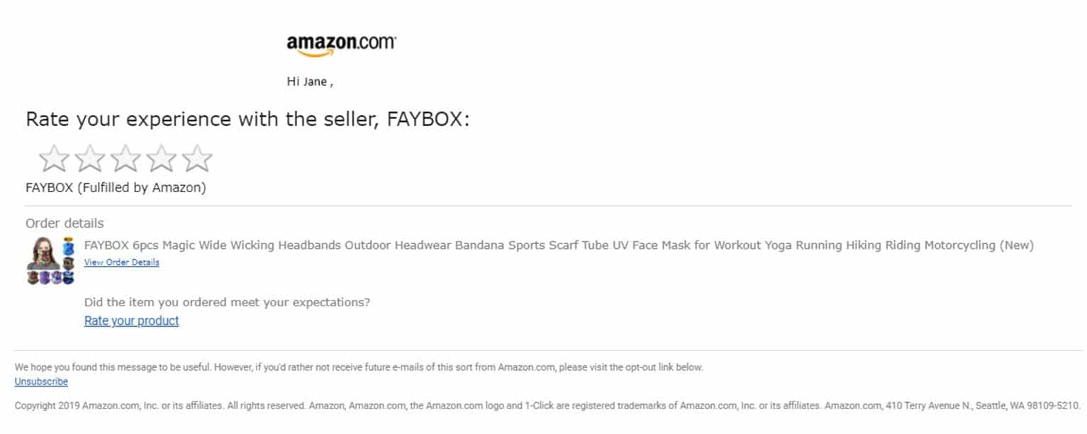
The subject line of this email includes the purchaser’s name followed by “Will you rate your transaction at Amazon.com?”
In this case, the company name is listed in the “from” field (From: Amazon Marketplace <[email protected]>), so it’s unnecessary to repeat it in the “subject” field. A better practice would be to fill the subject line with other text that is relevant and clear. However, the body of the email makes up for the minor faux pas. </[email protected]>
The transactional email design is clearly branded with the Amazon logo. It also includes 2 CTAs. The first is the call at the top to rate the experience, with clickable stars. Then there’s a “rate your product” link at the bottom in case you missed the first CTA. To jog your memory, the order shows an image of the recent product purchase as well as a description of the item.
Amazon also offers a clear unsubscribe option for recipients who might not be interested in receiving such transactional emails.
Shipping Confirmation
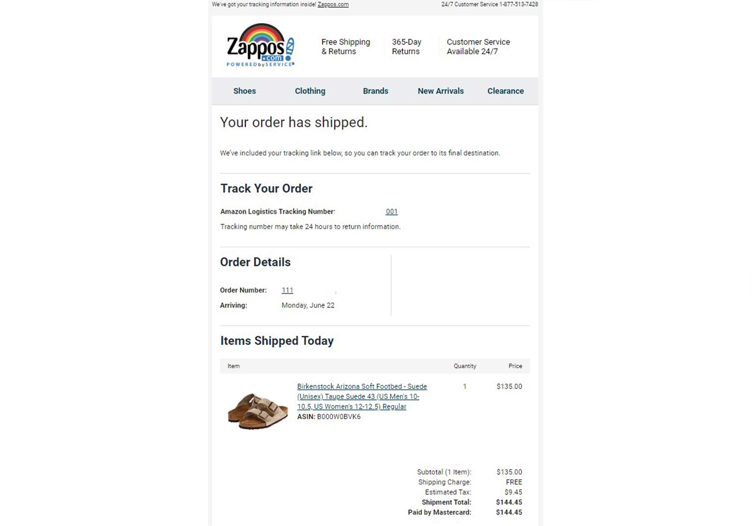
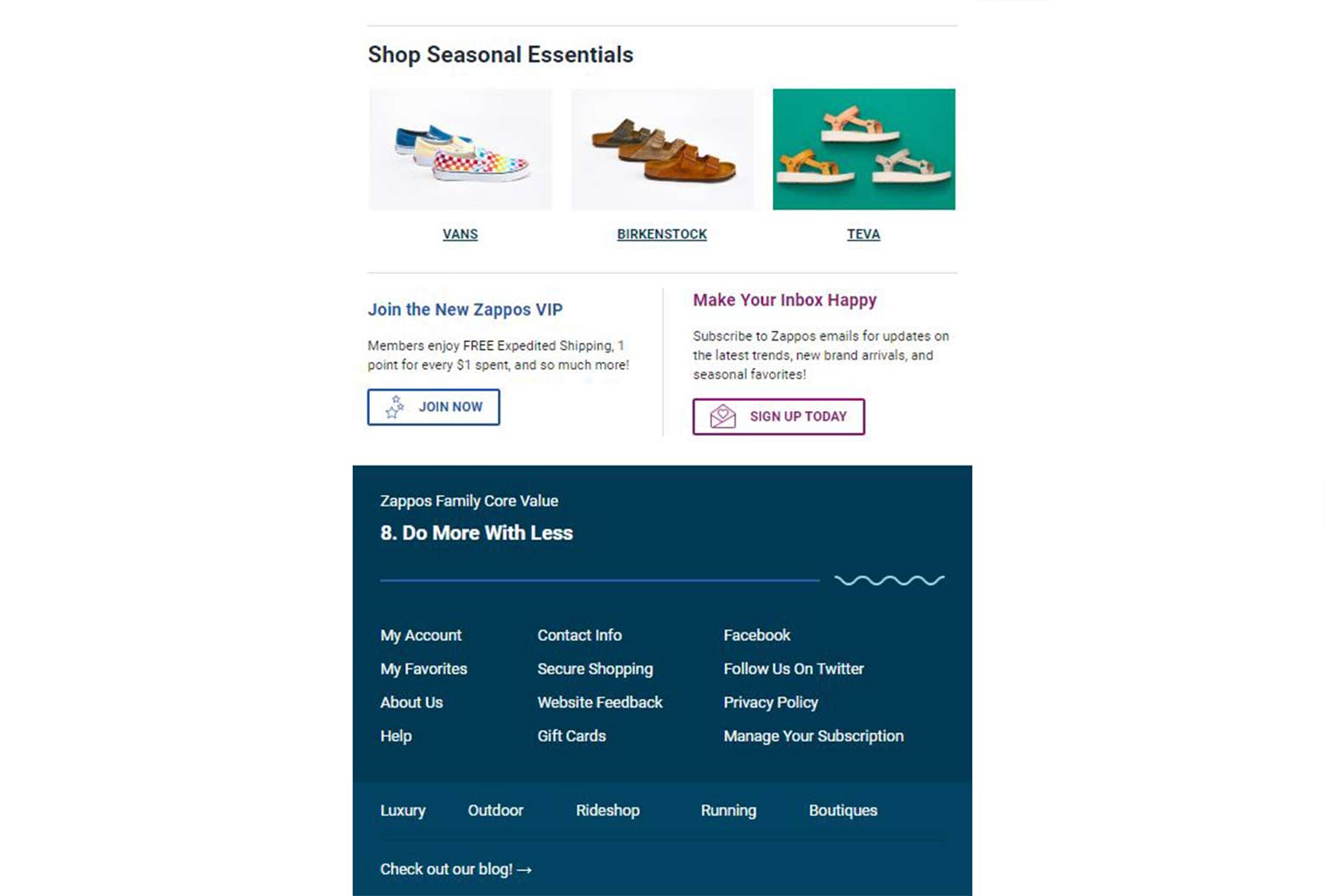
This shipment confirmation from Zappos includes many transactional email best practices.
Here’s the “from” field: Zappos.com <[email protected]> with the subject line reading “Your Shipment Confirmation.” </[email protected]>
Once you open this ecommerce transactional email, right away you see a personalized heading: Your order has shipped. There’s a clickable tracking link as well as a link to get more details about your order if needed. Zappos provides a delivery date as well as an image, item description and even pricing recap.
After you’ve seen everything you need to know about your order, they include images of other items you may like. They also include CTAs to join their VIP club and sign up for email updates. Other helpful links are included below along with a CTA to check out their blog.
Implementing Transactional Email Best Practices
When it’s all said and done, the goal of transactional emails is to give useful, timely and personalized information to an individual based on that person’s interaction with your brand – whether they opted-in to receive your newsletter, made a purchase on your site, need order updates or are requesting a refund.
While post-transaction follow-up is essential in ecommerce, transactional emails allow you to continue to build brand trust and awareness, too. Use our 11 best practices and examples to start creating your own emails today.


