An attractive, easily navigable store layout is a crucial part of the customer experience to help your brick-and-mortar store stay competitive against digital shopping’s convenience.
We’ll go through how to create a store layout plan, the qualities of a good store layout and the types of designs. Whether you’re planning a clothing or grocery store design, you’ll have the information to help you develop a shop floor plan that increases your profits by keeping customers happy.
What Is a Shop Layout?
Store layout is your retail space’s fixture placement (e.g., checkout points and aisles) and merchandise arrangement. A well-designed shop floor plan optimizes customer traffic flow and positively contributes to a store’s atmosphere.
How to Create a Store Layout
It’s essential to do your research before designing your store layout.
Your ideas should keep an “emphasis on the customer behavior and the customer experiences the retailer wants to achieve,” according to Lene Granzau Juel-Jacobsen in The International Review of Retail, Distribution and Consumer Research.
Factors affecting store layout also include the following:
Customer Desires
Refer to your customer research and determine what they need from your company and your store. Do they crave a luxurious experience or demand convenience? Perhaps your customer-centric space provides a bit of both using a combination of exciting displays and familiar floor layouts.
Think about who shops at your store as well. While a toy store might provide areas for play and room for strollers, an upscale boutique might deliver an experience designed solely for adults. Address the consumer’s main concerns first, then move on to the logistics of your store layout plan.
Store Density Levels
Store density levels matter for a couple of reasons. First, the appearance of a packed store draws people in by playing on their fear of missing out (FOMO). But if your customers can’t comfortably fit down an aisle, then they might be less likely to make a purchase.
Low traffic doesn’t mean you’ll lose out on sales, however, and not all stores need aisle space to fit an entire family. A simple retail store layout plan strikes a balance between both store traffic and customer traffic flow.
- Store traffic is the number of customers who will enter your shop on any given day. How many people do you expect to shop in your store regularly compared to maximum traffic days, like Black Friday?
- Customer traffic flow is the direction your customers will take once they enter your doors. How will customers navigate your store layout during slow and busy times? Will congested paths alter the flow of customers?
Stock and Presentation Space
Your stock and presentation space in your retail store layout affect customer impressions. If your customers crave value, full shelves can better appeal to these shoppers. However, “when you walk into a store, and there are fewer things on the floor, you tend to think they’re expensive,” according to Paco Underhill, author of “Why We Buy,” in an interview with The New York Times.
- Value. Tightly packed shelves allow you to showcase more items in less space. However, value shoppers want to quickly fill their shopping carts and that may require wider aisles.
- Exclusivity. Smaller display areas limit the number of items but may provide for more freedom of movement while narrow aisles encourage browsing.
Qualities of a Good Store Layout Plan
Regardless of your business, it’s crucial to create a shopper-centric yet operation-friendly retail layout.
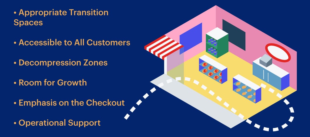
Appropriate Transition Spaces
From seating areas by waiting rooms to speed bumps that slow down busy consumers, the best floor plans provide transition spaces that help customers flow naturally throughout your store.
Accessible to All Customers
Meeting the Americans with Disabilities Act’s (ADA) accessibility requirements are non-negotiable. This includes not only the width of aisles but the height of your checkout areas.
Even if your retail space is limited, it’s critical to meet these guidelines and provide every customer with a trouble-free shopping experience.
Decompression Zones
Move display units a few feet back from the entry to avoid overwhelming customers with too much excitement immediately when they walk into your store. Keep in mind that not everyone is ready to start picking out items to purchase the moment they enter your doors. Some people might be following a shopping list, while others only want to browse.
Room for Growth
Investing a ton of money into set fixtures doesn’t make much sense if you can’t alter your space down the road. Although you might not know how your future store will change, the floor plan of a shop should include some flexibility. The ability to freshen your space with minimal reconstruction helps you in the long run.
Emphasis on the Checkout
Well-planned store layouts guide the shopper to the checkout area in a natural manner while also providing opportunities for extra purchases.
Operational Support
Although your focus should be on your customers, if your team can’t replace inventory without closing down an aisle, then you have a problem. Before finalizing your store layout plan, take a walk through from the perspective of an employee. This will help you avoid issues with stocking, moving displays or creating promotional spaces.
The Top 6 Store Layout Design Options
Choosing the best store layout isn’t a one-size-fits-all plan. What works for a high-scale boutique department may not be the best choice for your grab-and-go convenience store. Plus, you don’t need to stick to a single store layout design.
You can mix and match a couple of different styles to achieve your traffic goals and create a user-friendly space.
1. Free-Flow Layout
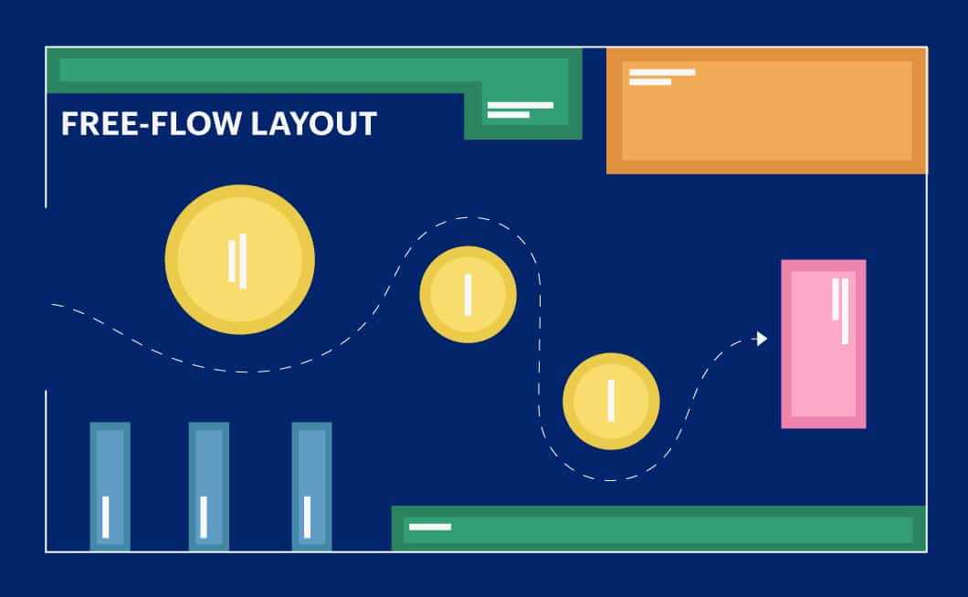
With a free-flow store layout, shelves tend to be lower, which helps customers locate products. A free-flow plan doesn’t use a set walkway or path around your shop. Instead, consumers are free to move in any number of directions. The design also aims to increase the time spent browsing in a store through well-placed seating areas, which could increase sales.
For example, The Wall Street Journal reports, “If you sit down in an Origins store, you’ll probably spend about 40% more than you would standing up.” Plus, the nature of a free-flow layout allows for both creativity and adaptability.
You’ll find freeflow designs in:
- Retail clothing shops
- Upscale businesses
2. Boutique Layout
This shop floor plan falls under the free-flow design style and is also known as an “alcove layout” or a “shop in a shop.” A boutique store layout organizes merchandise according to item type or brand and then physically divides the sections with aisle placement, walls or displays.
This retail layout type encourages customer curiosity when they see similar or complementary items on display in a particular segment of the store. Stores that use this type of layout plan include:
- Upscale clothing and accessories boutiques
- Specialty food and beverage shops (e.g., gourmet grocery stores)
3. Grid Store Layout
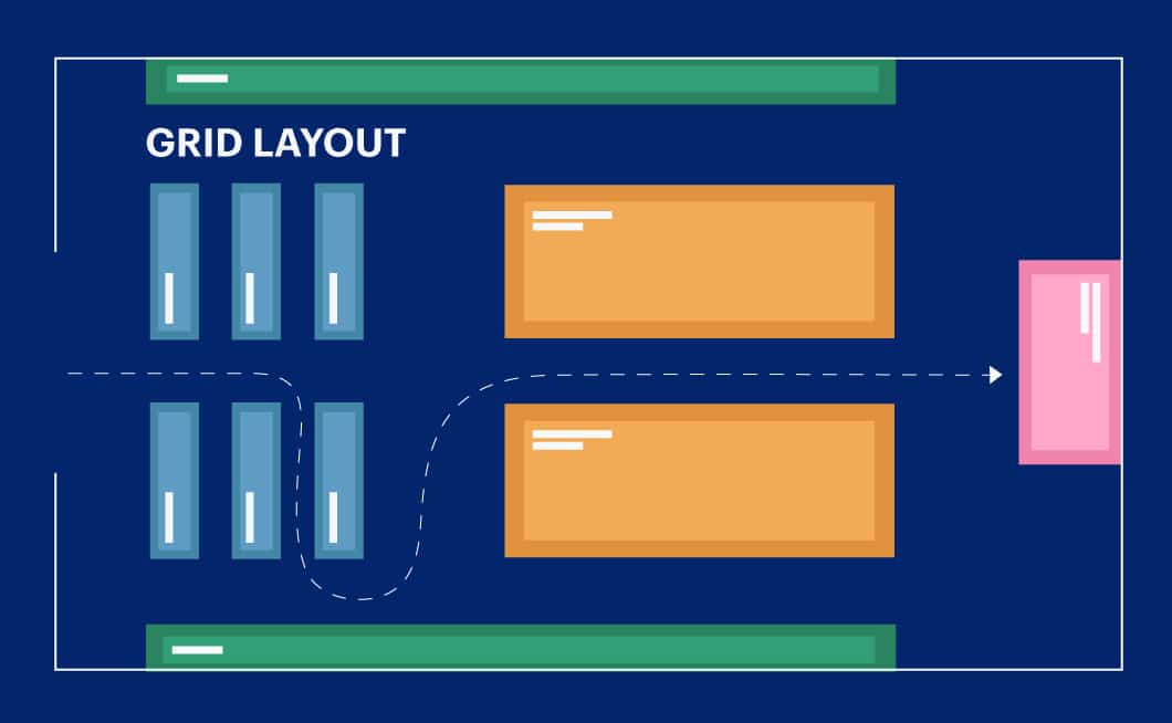
Grid floor plans, commonly found in grocery stores, provide a simple structure and familiar-feeling paths. This straight floor layout makes stocking and shopping easy for staff and customers. A grid store plan offers tons of display space, takes full advantage of corners and leaves room for end cap displays.
Grid store layouts are used by multiple types of stores, including:
- Convenience shops
- Home goods and supply stores
4. Racetrack or Circular Layout
Also called loop floor plans, the circular layout features a central aisle that leads customers through the store. You’ll notice this layout typically is used in department stores as the winding path takes customers past several departments and increases the chances for a customer to discover an item that wasn’t on their shopping list.
However, this plan works well for a variety of businesses, such as:
- Specialty product retailers
- Children’s toy and accessory shops
- Home and kitchen stores
5. Diagonal Floor Plan Layout
The difference between a diagonal and a grid layout is that you get more space in the former. Aisles are wider and shelves are lower as well. This type of design encourages shoppers to test out products or enjoy product demonstrations while providing staff with a clear line of sight.
A diagonal store layout is usually found in:
- Electronic stores
- Specialty makeup and personal supply boutiques
6. Mixed Store Layout Plan
While each of the above four choices works well for a variety of retail businesses, you can create your plan by combining a couple of store layout ideas.
For example, you’ll notice that some grocery stores design separate diagonal areas to attract shoppers to nonfood items. Play with your concept and dimensions by testing out different configurations until you find one tailored for your business and customers.
Whether you use grocery store design layout and planning services or do it yourself with free online tools, it’s essential to embrace the qualities of a good store layout. Your design affects profits, sales and customer experience.


