Your business website can make or break you. In today’s fast-paced world, first impressions mean a lot. Learn more about the features of a good business website — and how they make a positive impression.
According to research by Taylor & Francis, your website has about 50 milliseconds to give the right first impression. Not surprisingly, 94% of a customer’s first impression of you is design-related, according to research by Northumbria University and the University of Sheffield.
Your website needs to inspire confidence, trust and be aesthetically pleasing to be an asset to your business.
But what exactly are the features of a good business website versus bad ones? We’re so glad you asked.
Why Is a Good Business Website Important?
Besides being de facto required in this millennium, your business website is critical for:
1. Building Credibility
What’s the first thing most people do when they are interested in working with a company? Google them.
Your website doesn’t need to be a $100,000 work of art, but it does need to be professional, designed reasonably well and tell the visitor enough about you to show that you’re good at what you do.
2. Making That First Impression Count
As stated above, 94% of website first impressions are design-related. A study by Missouri University of Science and Technology used eye-tracking software to measure what people looked at and for how long when visiting an unfamiliar website.

We’ll cover specific design features below, but this study found the items users spent the most time looking at were:
- Company logo
- The navigation menu
- Social media links
- The website’s main image
- The footer area
While your website’s content is important for building trust, it isn’t a factor in first impressions which are all visual-based. Without a solid design, people aren’t going to stick around to read what you do or why you’re the best at it.
Let’s cover the specific things your business website needs to have.
Do: 6 Features of a Good Business Website
1. A Solid ‘About’ Page
As features of a good business website go, this is the most important page on your site — more so than your homepage or even your contact page.
An “about” page tells someone what you do, why you do it, who does it and where you do it. It should answer every question a prospect has about working with you. It should showcase how you do what you do, the clients you work with, and where you’re located (especially if you’re a local-only business).
Prospects should read your “about” page and feel confident that you can solve their problems.
Be sure to include:
- Your mission and values
- Your team
- The types of clients you serve and where you’re located
Mailchimp does a great job of highlighting their values by talking about its corporate culture. They back up claims of existing to “[help] small and medium-sized organizations get started and grow” by featuring their charitable donations of more than $12 million to date.

2. A Call to Action
Ever been to a website of a company you really wanted more information from but weren’t sure what to do?
Have you hunted around for a “Contact Us” link or even just a phone number?
Make it overly easy for people to reach out. That’s the entire purpose of your website: to drive leads.
Keep your contact information in the footer, but be sure to include calls to action in:
- Your navigation/header area
- Your footer
- Articles and/or video content
- Services pages
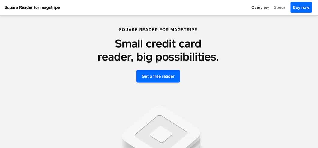
Square features clear calls to action that stand out thanks to bright blue buttons. They have one to, “Get a free reader” and one to “Buy now.”

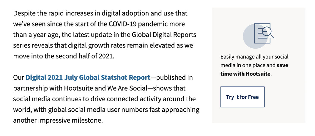
Hootsuite includes a sticky call to action to the side of their blog content as well as at the end of articles.

3. Testimonials
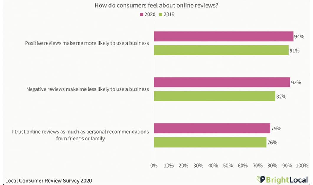
Your business website needs testimonials. Research by BrightLocal found 94% of people are more likely to buy from a business with positive reviews.
Surprisingly, BrightLocal also found 79% of people trust online reviews as much as recommendations from their own family or friends.

Testimonials are a literal goldmine. Sprinkle them around your website liberally, with special attention to your:
- Homepage
- Product or service pages
- Contact page
4. Cheese-Free Images
You can invest money in a professionally designed and written website, but if you cheap out with basic stock photography, it can cheapen the entire package.
Stock photos have their place and they can be useful. But if every photo on your website is stock, people will wonder if you even exist.
At the minimum, hire a professional photographer to take a team photo for your “about” page, and ideally, individual headshots of your staff, too. It humanizes your company and lets visitors know you’re real.
Of course, if you sell physical products, photography isn’t optional. If budget is an issue, hire a photographer to take a few for your website. For more content, partner with influencers to use their photos or ask people to share their shots via a social media hashtag you can feature on your website.
5. Mobile-First Design
According to Google, more than 50% of all web traffic now comes from mobile devices. That shouldn’t be surprising since this shift has been happening for the last decade.
Sure, your website looks okay on a smartphone, right? You can read the copy, the navigation is there. But does it work well?
Your goal shouldn’t be to squeeze a computer-sized website into a tiny mobile version. Your goal should be to build a website with mobile in mind first, then scale it up to desktop after.
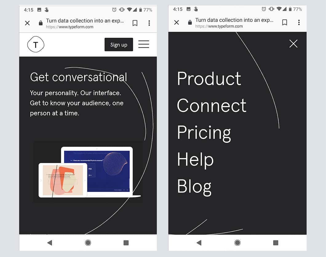
For example, Typeform keeps its overall design simple and functional for mobile devices. The “Sign up” call-to-action is bold and finger-sized so it’s easy to tap on the first try. Additionally, their menu items pop out nice and big so you can navigate easily.

6. Skimmable Content
While there are times your customers may want to sit down and read an article about cloud storage rivaling the length of “War and Peace,” today probably isn’t that day.
Creating skimmable content means you can still write in paragraphs, but break it up with headings, lists, pull-out quotes or other elements so that a user doesn’t have to read your entire opus to understand it.
Skimmable content breaks up walls of text into smaller chunks so that:
- Customers can understand key concepts faster.
- Customers can retain more of what they read afterward.
- (Would you be reading this if it wasn’t in a bullet point?)
See? Attention spans just aren’t what they used to be, at least for anything other than Netflix queues.
Don’t: 3 Things to Never Have on Your Business Website
1. A Blog … That’s Never Updated
A blog is an excellent way to attract new customers and drive sales. Content marketing brings in about 3 times as many leads as conventional advertising but costs 62% less.
But the worst thing you can do is post a few great blog posts then go dark. It’s 2021 and a prospect who is excited to work with you checks out your website. Oh, your last blog post was in 2017. Hmm, red flag.
Unless you can devote the necessary time to produce valuable content marketing (or hire someone else to do it), don’t bother adding a blog to your business website.
2. Typos and Inaccuracies
You wouldn’t believe how many business websites contain more than one typographical error.
Sure, it happens to the best of us. But proofread your website content multiple times before posting. Or hire someone else to do it. Having typos or inaccurate information on your site undermines your credibility and makes it very difficult to build trust with new leads.
3. Black Hat SEO Tactics
This refers to methods of ranking highly in Google searches that were popular in the mid-90s to early 2000s. Back then, search engines weren’t as sophisticated at spotting spam as they are now. Tactics such as keyword stuffing or buying links could easily rank you No. 1.
Nowadays, not only will those tactics not work, they will permanently blacklist you with Google’s ranking algorithm and damage your business reputation among anyone who knows anything about marketing. Stay far away from any company that claims they can rank you No. 1 on Google using these sketchy tactics.
How Does Your Business Website Stack Up?
It’s obvious that these days a good business website isn’t optional.
Customers are savvier and more adept at judging an organization’s credibility based on its online presence. Yes, you can be a great company doing great work with a less-than-ideal website, but is that really the hill you want to die on?
Maintaining your website to current design standards should be a part of your regular marketing budget. Employ features of a good business website to succeed.
More than simply design, you need to spend time creating a valuable “about” page, strategically placing your calls-to-action and ensuring every part of your site is mobile-first. Invest in your business website and it will pay off.


